Physics Graphing Guidelines
Being able to create a meaningful graph that is easy to use and interpret is an important science skill. You are expected to produce excellent graphs as outlined in the following guidelines. Note that these guidelines apply whether making the graph by hand or by computer program.
· Graph Paper – There must be a grid composed of horizontal and vertical lines, preferably with at least 4 squares per inch
· Title – At the top of the page place a title of the form “y versus x” often followed by a descriptive phrase. For example, a graph that shows on the y-axis the distance a car travels and on the x-axis the elapsed time might be titled: Distance versus Time for a Car on a Roadway.
· Independent Variable – Unless there is a good reason to do otherwise, put the independent variable on the x-axis. The independent variable has a value that is not influenced by (or is independent of) the dependent variable and is often (but not always) under the control of the experimenter.
· Dependent Variable – Unless there is a good reason to do otherwise, put the dependent variable on the y-axis. The value of the dependent variable is influenced by (or is dependent upon) the value of the independent variable. Typically the experimenter varies the value of the independent variable to see what effect this has on the dependent variable.
· Scales – Choosing an appropriate scale is important to make the graph as precise and meaningful as possible and yet easy to read and interpret. For these reasons choose for each axis a scale where each square equals 1, 2, or 5 × 10n and where the data cover as large a span of the page as possible. In other words, choose a scale that will make the data cover most of the page but which is also convenient and easy to use and read. It is best for the scales to extend to and include the origin. Only use a break in a scale and/or omit the origin if this will result in a more meaningful graph that better displays the data. It is not necessary to label every single line on the scale.
· Labels – On each axis label the name of the variable and next to this, in parentheses, the units.
· Data Points – Plot data using an appropriate symbol including a “point protector”. For example, use a small dot surrounded by a circle. The small dot shows the data point and the circle “protects” it from being overlooked or overwritten and obliterated by a line on the graph. The small point can be surrounded by other geometric figures. Alternatively an “ex” is a way to specify a point and at the same time protect it. If there are multiple sets of data on the same graph there must be a legend or key and a way to distinguish the different sets. The actual numerical data (i.e. the data table) does not need to appear on the graph.
· Line or Curve of Best Fit – Do not connect the dots by placing line segments between each successive data point. Instead, construct a line or curve of best fit that that shows the most likely actual relation between the x and y variables allowing for random error in the data points. This means that the best fit will go “through the middle” of the data points with roughly equal numbers of points above and below. The best fit will pass as close as possible to as many data points as possible but it may or may not actually “hit” data points. This line or curve can be found by a variety of techniques that are presented in class during the year.
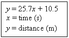
· Equation –
Include on the graph the equation that corresponds to the line or curve of best
fit. The equation should be given in one of the following two
formats (the purpose of which is to make very clear the meaning of the
equation):
OR
![]()
The form on the left shows the meaning of x and y and what units
are to be used. The form on the right incorporates the units with the
numerical values that appear in the equation and uses standard symbols to
replace and make clear the meaning of x and y. In the case
where you have calculated the equation yourself, show the work that produced
the number(s) in the equation. In the case where the equation is found by
computer or calculator, include in the result the correlation coefficient, R.
Put all of this information directly on the graph – not on a separate
page. In either case it is important that the equation given actually
matches (i.e. would produce) the line or curve of best fit that is drawn on the
graph.
· Key or Legend – If multiple sets of data are plotted on the same graph is it important to include a key or legend that allows the reader of the graph to distinguish the various data points. This is done by using different point protector symbols for each data set and/or by using different colors.
· Miscellaneous – It is not necessary to include on the graph a table of data – this may be on a separate page, preferably preceding the graph. Nor is it necessary to label each data point on the graph with its coordinates.
· Example – For an example including commentary click here.